MJ Lindeman, PhD, Community Partner
Apr 15, 2025

When communicating data patterns, it is crucial to choose the right data visualization for transforming the raw numbers into actionable insights. With so many different types of charts and graphs available, selecting the most effective visual representation can be challenging, even for experienced analysts. Should you use a bar chart or a line chart? When is a heatmap more effective than a scatter plot? Understanding the various types of charts for data visualization and knowing when to use different chart types can significantly improve how well you identify actionable insights and then communicate them to your audience.
Visual analytics has evolved from simple graphs to sophisticated interactive visualizations, offering powerful ways to explore and communicate complex data. However, this evolution has also created a paradox of choice. With dozens of data visualization chart types available, it is difficult to know how to choose the right data visualization. This comprehensive guide was created by using the Quadratic AI spreadsheet to create different chart types. These visualizations can help you make informed decisions about charting and plotting your data.
Quadratic's integration with Plotly provides access to a wide range of Plotly chart types, from basic visualizations to advanced data analytics and visualization techniques. By providing an AI assistant, Quadratic transforms the process of choosing a good chart from a technical challenge to an intuitive conversation about your data. Rather than memorizing complex rules for choosing the right chart for your data, you can simply describe what you want to understand about your data, and the AI will guide you to the best Plotly visualizations for your specific needs.
This post illustrates 26 of the different types of graphs and charts available in Quadratic, organized by the fundamental analytical questions they help answer. Whether you're comparing values, analyzing trends, exploring distributions, or investigating relationships, understanding these data visualization techniques will empower you to create more effective and insightful data stories. In addition to the organization of the chart types by analytical purpose, the caption of each chart describes the best use of that type of chart.
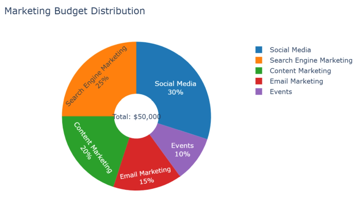
In real-time, the Quadratic AI spreadsheet provides interactive features that are not obvious in the screenshots below. For example, the pie/donut chart shows a budget distribution across five marketing channels. Percentages and labels are shown, and hovering over an area displays the exact dollar amounts. The AI suggested three additions to the chart: comparing with the industry average, showing the monthly breakdown, or adding ROI metrics.
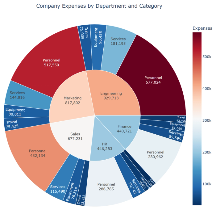
In a similar starburst chart, you can hover for the exact expense amount, click on segments to zoom in, or click the center to zoom out. Changes in attributes such as colors, fonts, and bar sizes are done with a simple request to the AI explaining what you want as the prompt’s result. You can use Quadratic AI for free to explore the interactive features of each type of chart - spreadsheet templates are a great place to start!
Chart types by analytical purpose
Twenty-six types of charts for data visualization are shown in this post. Each chart has a brief caption that describes the best use of that chart type. Also, the charts are organized into seven categories for types of use:
- Charts for showing change over time
- Charts for showing part-to-whole compositions
- Charts for examining data distributions
- Charts for comparing values between groups
- Charts for observing relationships between variables
- Charts for visualizing geographical data
- Charts for project management
The Quadratic AI can generated sample data from AI. Thus, all information is simulated except for the GNP per capita dataset.
Charts for showing change over time
Time is perhaps the most fundamental dimension for analysis. Visualizing how values evolve over time reveals trends, patterns, seasonality, and anomalies that might otherwise remain hidden in rows of numbers. Whether you are tracking sales performance, website traffic, or stock prices, time-series visualizations provide critical context for understanding where you have been and where you might be heading. By simply asking the AI assistant to identify seasonal patterns or forecast future trends, you can transform raw temporal data into actionable insights that drive strategic decisions.
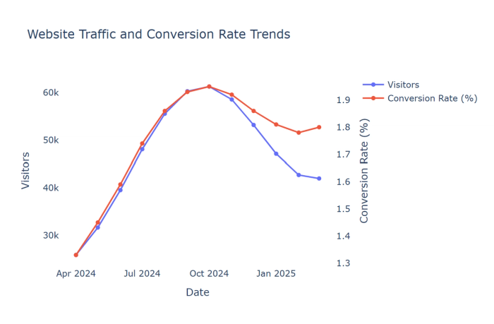
1. Line charts: Display trends for continuous data over time, showing patterns, trends, and fluctuations for one or more variables.
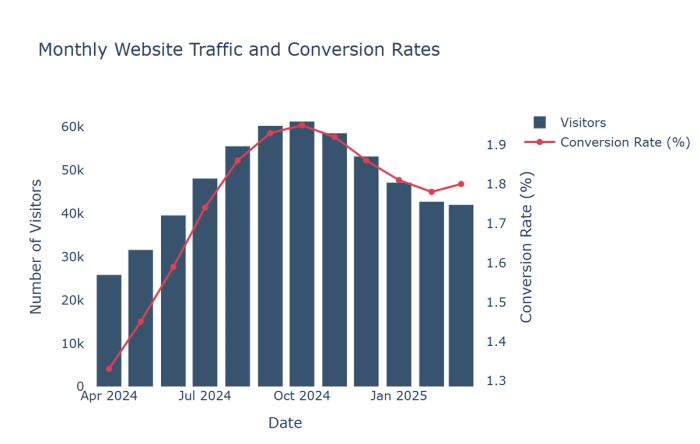
2. Bar-column-Time charts: Compare values across discrete time periods with emphasis on specific comparisons.
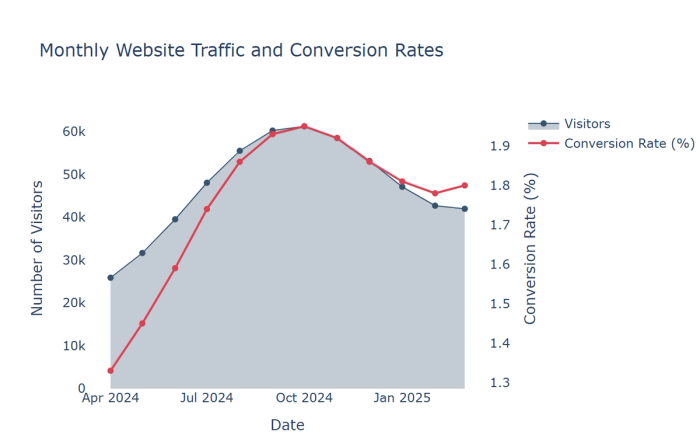
3. Area charts: Show cumulative totals over time with filled areas beneath lines to emphasize magnitude.
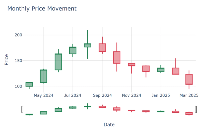
4. Candlestick charts: Specialized financial charts showing opening, closing, high, and low values within time periods.
Charts for showing part-to-whole compositions
Understanding how individual components contribute to a whole is fundamental to many business analyses. Whether you're examining budget allocations, market share, or revenue by product line, composition visualizations help stakeholders grasp proportional relationships intuitively. These charts answer crucial questions like "Where are we investing our resources?" and "Which segments contribute most to our overall performance?"
Quadratic excels at creating these visualizations by automatically identifying hierarchical relationships in your data. With the AI’s assistance, you can instantly transform complex compositional data into clear visual hierarchies that reveal the relative importance of different components and how they work together to form the complete picture.
5. Pie/donut charts: Display proportional relationships within a single data series when there are few categories (5 or fewer)
6. Sunburst charts: Display hierarchical data as concentric rings, with inner rings representing higher levels in the hierarchy
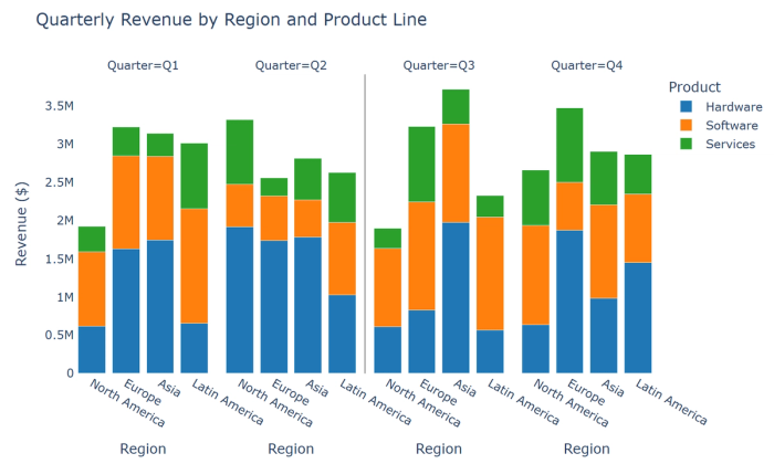
7. Stacked bar charts: Show composition within categories while also enabling comparison between categories
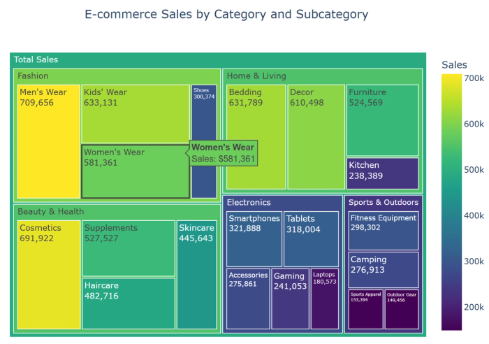
8. Treemaps: Visualize hierarchical part-to-whole relationships with nested rectangles, particularly useful for many categories
Charts for examining data distributions
Behind every average lies a distribution, and the shape of the distribution often tells a more nuanced story than summary statistics alone. For example, distribution visualizations reveal the spread, central tendency, and outliers in your data, providing deeper insights into variability and potential anomalies. Whether you're analyzing customer spending patterns, performance metrics, or response times, understanding the full distribution leads to more informed decisions.
Quadratic's AI can help you identify the appropriate distribution visualization for your data and then interpret what the patterns mean. By asking the AI about the significance of outliers or the shape of your distribution, you can quickly determine whether your data follows expected patterns or contains insights that merit further investigation.
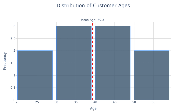
9. Histograms: Show frequency distributions by grouping numeric data into bins.
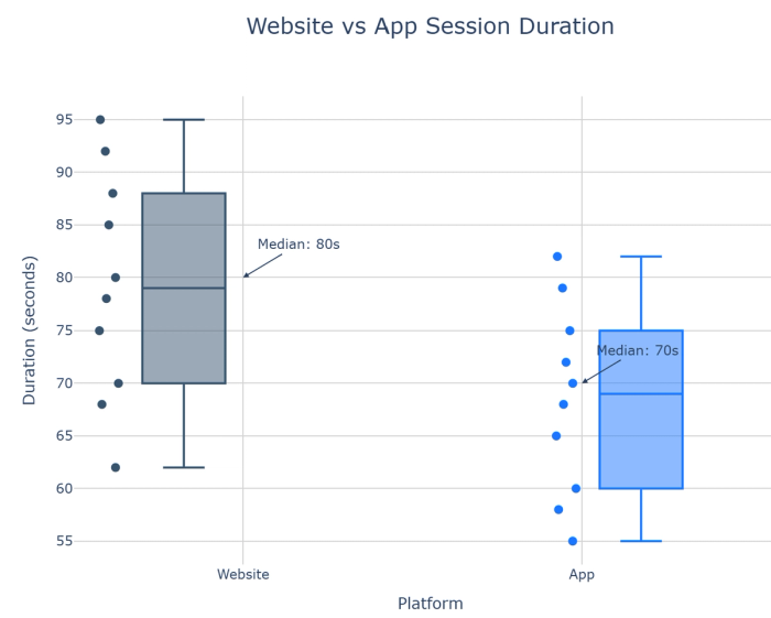
10. Box plots: Provide statistical summaries of distributions showing median, quartiles, and outliers.
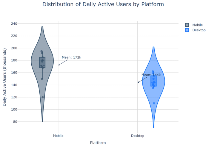
11. Violin plots: Combine box plots with density plots to show distribution shape alongside summary statistics.
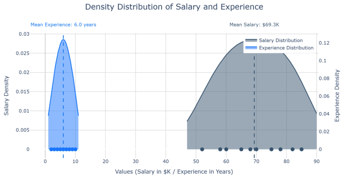
12. Density plots: Display smoothed distributions without discrete bins, useful for showing the probability density.
Charts for comparing values between groups
Comparison is at the heart of many analytical questions: Which products are performing best? How do different regions compare on key metrics? Are we meeting our targets? Comparative visualizations provide clear answers to these questions by placing different values side by side for easy evaluation.
In Quadratic, creating effective comparisons becomes almost effortless with AI assistance. The AI can identify the most appropriate chart type based on your data structure and analytical goals, even suggesting groupings or sortings that highlight the most meaningful differences. Whether you're comparing performance across categories, time periods, or benchmarks, these visualizations provide the clarity needed for confident decision-making.
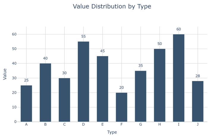
13. Bar-column-Categories charts: A bar-column-Categories showing values across categories with an emphasis on magnitude.
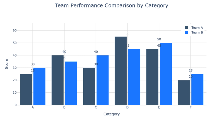
14. Grouped bar charts: Compare multiple metrics across categories, with bars grouped by category.
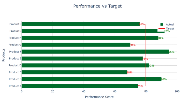
15. Bullet charts: Compare actual values against targets or benchmarks with reference ranges.
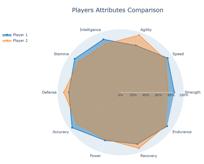
16. Radar/spider charts: Compare multiple variables across categories by plotting on radial axes.
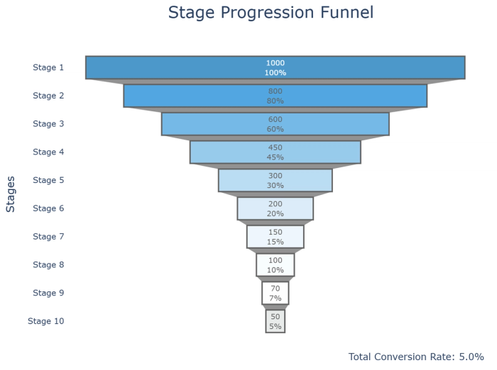
17. Funnel charts: Show values through sequential stages, typically used for conversion or sales processes.
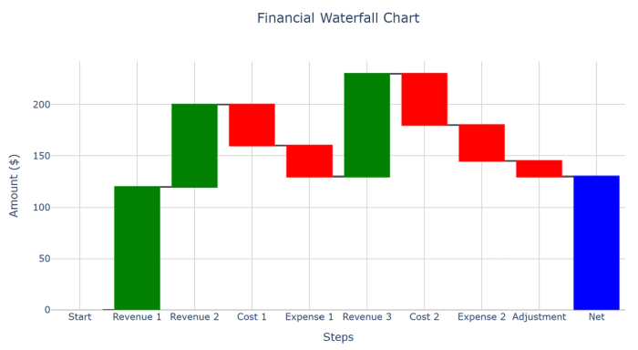
18. Waterfall charts: Show how a series of positive and negative values contribute to a total.
Charts for observing relationships between variables
Some of the most valuable insights come from understanding how variables relate to each other. Is marketing spending correlated with revenue? Do customer satisfaction scores predict retention? Relationship visualizations reveal these connections, helping you identify correlations, clusters, and outliers that might suggest causal relationships.
Quadratic's integration of advanced visualization capabilities with AI assistance makes relationship analysis more accessible than ever. By simply asking the AI to explore relationships in your data, you can discover patterns that might have remained hidden in traditional analysis. These insights from AI spreadsheet analysis can inform predictive models, optimization strategies, and a more nuanced understanding of your business dynamics.
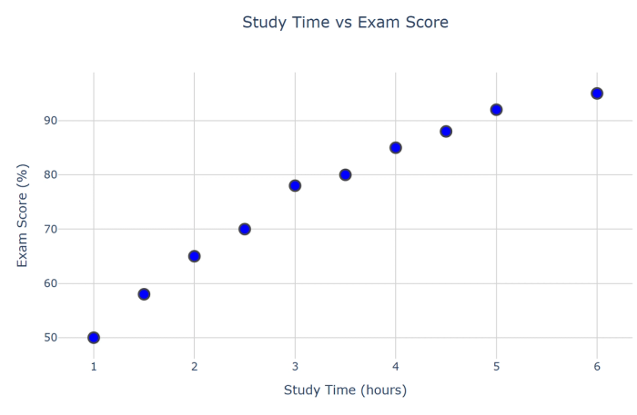
19. Scatter plots: Display relationships between two continuous variables to identify correlations.
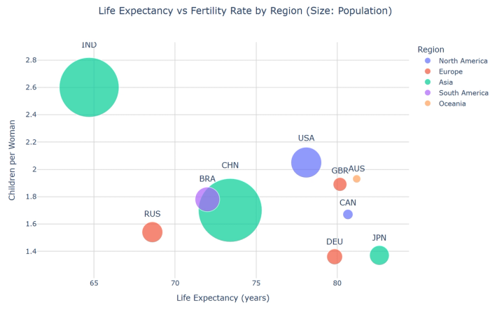
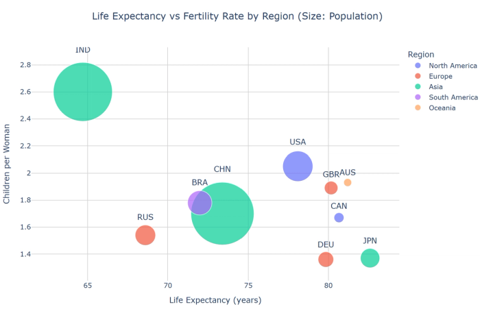
20. Bubble charts: Extend scatter plots with a third variable represented by bubble size.
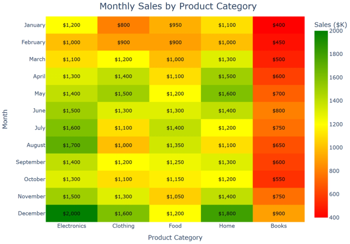
21. Heatmaps: Show relationships between categorical variables through color intensity.
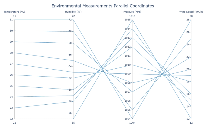
22. Parallel coordinates plots: Visualize multivariate data by plotting each observation as a line across parallel axes.
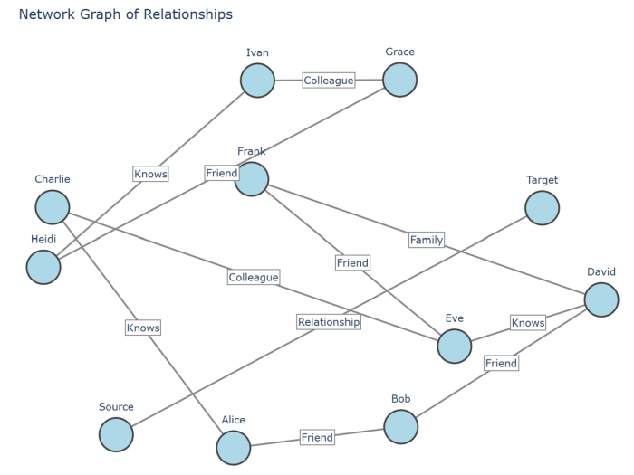
23. Network graphs: Display connections between entities as nodes and edges, showing relationship patterns.
Charts for visualizing geographical data
Location adds a crucial dimension to many analyses, revealing patterns that might be invisible without geographical context. Statistics such as regional sales variations, customer density by location, or operational efficiency across different sites take on new meaning when visualized on a map.
Quadratic combines powerful geographical visualization capabilities with AI assistance to make spatial analysis accessible to everyone. The AI can help you match your location data to the appropriate geographical boundaries and suggest the most effective visualization approach. Whether you're analyzing global trends or local patterns, geographical visualizations provide an intuitive way to understand how location impacts your business outcomes.
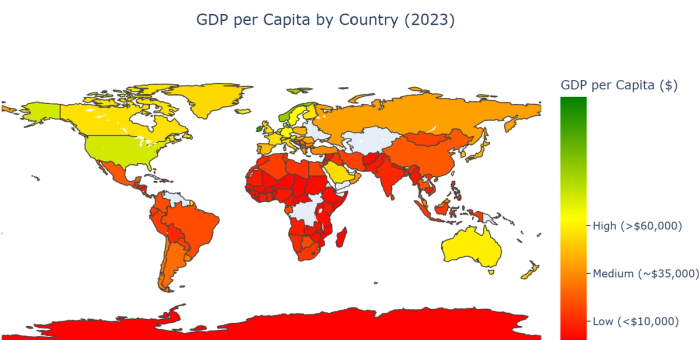
24. Choropleth maps: Display variations across regions through color shading.
25. Bubble maps: Show values at specific locations with circles sized according to value.
Charts for project management
Effective project management relies on clear visualization of timelines, dependencies, and progress. Project management charts provide a visual framework for planning, tracking, and communicating about complex initiatives with multiple moving parts.
In Quadratic, these visualizations become powerful collaboration tools that keep teams aligned and projects on track. With the AI’s assistance, you can quickly generate comprehensive project timelines, track progress against milestones, and identify potential bottlenecks before they impact your deadlines. By visualizing your project data, you transform abstract plans into concrete visual roadmaps that enhance accountability and execution across your organization.
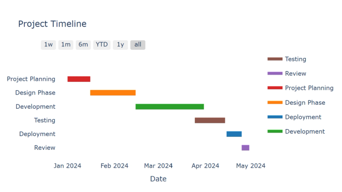
26. Gantt charts: Display project schedules with tasks represented as bars spanning their duration.
Conclusion: Making data visualization choices with confidence
As we've explored throughout this guide, the rich ecosystem of data visualization techniques offers powerful ways to analyze and communicate insights. From simple bar charts to complex geographic visualizations, each chart type serves a specific analytical purpose. The key to effective data exploration and visual analytics is understanding which chart plotting tools best serve your specific analytical goals.
When wondering how to pick a chart type, consider these fundamental questions:
- What analytical question are you trying to answer? (Trend analysis, composition, distribution, comparison, relationship, or geographic insight)
- What types of data are you working with? (Categorical, numerical, temporal, geographic)
- Who is your audience, and what level of visualization complexity will they understand?
- How many variables do you need to represent simultaneously?
Quadratic simplifies this decision-making process by combining Plotly's comprehensive visualization capabilities with AI assistance. Rather than struggling with the technical details of different types of bar charts or specialized visualization techniques, you can describe what you want to understand about your data in natural language, and the AI will help you select and create the optimal visualization.
The integration of AI assistance with powerful chart plotting tools represents the next evolution in data analytics and visualization. By removing technical barriers to creating sophisticated visualizations, Quadratic democratizes access to insights that might otherwise remain hidden in the data. Whether you're exploring customer behavior, analyzing financial performance, or optimizing operations, choosing the right data visualization is now as simple as having a conversation about your data.
As you continue your data visualization journey, remember that there is rarely one "perfect" chart type for a given situation. Different chart types often reveal different aspects of the same data. Experiment with multiple approaches, seeking the visualization that most clearly communicates the story your data is telling. With Quadratic's intuitive interface and AI assistance, you can quickly explore different types of charts for data visualization without getting lost in technical details.
Ready to transform your approach to types of data visualization? Try Quadratic’s AI chart generator and experience how the combination of comprehensive visualization capabilities and AI guidance can help you create more insightful, impactful, and beautiful data visualizations that drive better decision-making across your organization.


