
Cole Stark, Head of Growth
Apr 4, 2025

Understanding data quickly is essential for investors to make timely decisions in the market. Yet, even the most sophisticated analysis depends fundamentally on the quality of the underlying data. Without reliable, accurate data, any analysis risks becoming ineffective or misleading.
Traditionally, both professional and retail investors have relied on financial tools with rigid user interfaces, limiting their ability to adapt quickly or perform nuanced analyses. Many investors now turn to modern, flexible data analysis platforms directly connecting to APIs, allowing real-time data retrieval and customized, precise analytical workflows.
What is Intrinio?
Intrinio is a global leader specializing in core financial data products essential to fintech platforms, financial institutions, developers, and various businesses. What sets Intrinio apart is their unparalleled expertise in financial data standardization, particularly:
- Expert handling of XBRL filings, providing clean, reliable data.
- Advanced machine learning-driven standardization technologies.
- Flexible licensing and customized data packages tailored specifically for diverse business needs.
Why combine Quadratic with Intrinio?
Quadratic integrates Python, SQL, and JavaScript into a familiar spreadsheet interface, enabling users to perform sophisticated data analysis and visualization based on data they drag-and-drop into the sheet, query from their database, or connect via API.
By integrating Intrinio's powerful real-time financial data APIs into Quadratic, users can:
- Directly integrate real-time and historical market data into your spreadsheets, eliminating the inefficiencies associated with manual data entry or external software.
- Use Python scripting within Quadratic for customized calculations, precise data cleaning, and streamlined automation of financial workflows.
- Instantly visualize stock trends and market movements using Quadratic's integrated graphing and interactive visualization capabilities.
- Automate complex financial modeling seamlessly within your spreadsheet, without the need to rely on additional tools or complicated external processes.
Creating interactive ETF visualizations with Quadratic and Intrinio
Let's demonstrate how easily you can leverage Intrinio’s API within Quadratic to visualize real-time ETF data with an interactive treemap visualization.
Prerequisites
Before getting started, ensure you have the following:
- A free Quadratic account
- An Intrinio API key
- Basic familiarity with Python and REST APIs
Step 1: Retrieve your Intrinio API key
To use Intrinio’s API, first visit Intrinio.com and either Request a Consultation or use the live chat to access a free trial of their 15-Min Delayed IEX Data. Special Promotion for Quadratic Users: Use the promo code QUAD-DATA to get 50% off your first month of Intrinio.
Step 2: Open Quadratic and start a Python cell
Open Quadratic, create a new spreadsheet, then press forward slash (/) in any cell and select Python to start a new Python code cell. Quadratic supports Python’s requests library, making it easy to connect directly with APIs.
Step 3: Fetch real-time stock data
Paste the following Python script into your new code cell to fetch and visualize recent stock price data from Intrinio:
import requests
import pandas as pd

# Replace 'YOUR_API_KEY' with your actual API key from Intrinio
api_key = 'YOUR_API_KEY'
ticker = 'AAPL'

# Intrinio API endpoint for stock prices
url = f'https://api-v2.intrinio.com/securities/{ticker}/prices'

# Parameters
params = {
    'api_key': api_key,
    'page_size': 5  # 5 days worth of prices
}

# Make the request
response = requests.get(url, params=params)

data = response.json()
if "stock_prices" in data:
    df = pd.DataFrame(data["stock_prices"])
    df = df[["date", "adj_close", "adj_volume"]]  # Keep only date, adjusted closing price, and adjusted volume columns
else:
    df = pd.DataFrame([])

# Log to the console to see what the data looks like from Intrinio
# Additional fields can be added to
print(data)

df.head()  # Display the first few rows in Quadratic
This script requests recent stock price data from Intrinio, processes it into a clear format using Pandas, and automatically displays the output directly within your Quadratic spreadsheet.

Step 4: Analyze and visualize API data in Quadratic
Once your data is loaded into Quadratic, you can easily:
- Sort and filter data using intuitive spreadsheet functions or Quadratic’s integrated AI.
- Run additional Python scripts to enhance your analysis with moving averages, custom metrics, and more.
- Quickly build insightful charts and visualizations using Quadratic’s built-in Plotly support.
Let’s try something a bit more advanced. Paste the following Python script to generate an interactive ETF treemap:
import pandas as pd
import plotly.express as px
import requests
from datetime import datetime, timedelta
# Intrinio API credentials (Replace YOUR_API_KEY with the key you obtain from Intrinio)
api_key = "YOUR_API_KEY"
headers = {"Authorization": f"Bearer {api_key}"}
# Define sector ETFs
sector_etfs = {
"XLK": "Technology",
"XLF": "Financial",
"XLV": "Healthcare",
"XLE": "Energy",
"XLP": "Consumer Staples",
"XLI": "Industrials",
"XLY": "Consumer Discretionary",
"XLU": "Utilities",
"XLC": "Communication Services",
"XLB": "Materials",
"XLRE": "Real Estate"
}
# Calculate dates for the last 30 days
end_date = datetime.now().strftime('%Y-%m-%d')
start_date = (datetime.now() - timedelta(days=30)).strftime('%Y-%m-%d')
# Parameters for historical data
params = {
"start_date": start_date,
"end_date": end_date
}
# Get data for sectors
all_data = []
try:
for ticker, sector_name in sector_etfs.items():
# Get sector ETF performance
url = f"https://api-v2.intrinio.com/securities/{ticker}/prices"
response = requests.get(url, params=params, headers=headers)
if response.status_code == 200:
price_data = response.json().get('stock_prices', [])
if price_data and len(price_data) >= 2:
first_price = price_data[-1]['close']
last_price = price_data[0]['close']
percent_change = ((last_price - first_price) / first_price) * 100
# Get sector data
sector_entry = {
"name": sector_name,
"parent": "Market",
"ticker": ticker,
"percent_change": round(percent_change, 2),
"price": last_price
}
all_data.append(sector_entry)
# Create DataFrame for visualization
df = pd.DataFrame(all_data)
# Add root node
root = pd.DataFrame({
"name": ["Market"],
"parent": [""],
"ticker": ["MARKET"],
"percent_change": [df['percent_change'].mean()],
"price": [0]
})
df = pd.concat([root, df], ignore_index=True)
# Create treemap
fig = px.treemap(
df,
ids="name",
names="name",
parents="parent",
values="price",
color="percent_change",
color_continuous_scale="RdYlGn",
title=f"Market Sector Performance ({start_date} to {end_date})",
custom_data=["ticker", "percent_change", "price"]
)
# Update hover template
fig.update_traces(
hovertemplate="<b>%{id}</b><br>" +
"Ticker: %{customdata[0]}<br>" +
"Change: %{customdata[1]:.2f}%<br>" +
"Price: $%{customdata[2]:.2f}<br>" +
"<extra></extra>"
)
fig.update_layout(
coloraxis_colorbar=dict(
title="% Change",
tickformat=".2f"
)
)
except Exception as e:
print(f"An error occurred: {str(e)}")
fig = px.treemap(
pd.DataFrame({"name": ["Error"], "parent": [""], "value": [100]}),
ids="name",
names="name",
parents="parent",
values="value",
title=f"Error retrieving data: {str(e)}"
)
# Display the interactive treemap
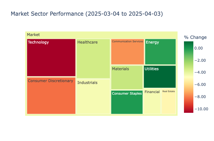
fig.show()This script retrieves 30 days of historical prices for each sector ETF from the Intrinio API and computes the monthly percentage change. It then stores the results in a DataFrame, adds a “Market” root node, and creates a treemap visualization using Plotly Express. Each ETF is represented by a tile sized by its closing price, and color-coded by its percentage change over the period, giving a quick snapshot of overall sector performance.
Conclusion
Pairing Quadratic’s analytical features with Intrinio’s financial data creates a powerful environment for more efficient and insightful analysis. By integrating these tools, analysts and investors can enhance their workflows, deepen their analyses, and ultimately make better-informed decisions.
Want to work with real-time financial data in your spreadsheet? Don’t forget to use the promo code QUAD-DATA to get 50% off your first month of Intrinio. Simply sign up, message Intrinio, or complete the form using this code to redeem your discount.


