Cole Stark, Head of Growth
Dec 18, 2024

Numbers are everywhere—embedded in reports, dashboards, and spreadsheets that guide our business decisions. Yet despite their ubiquity, data alone isn't always persuasive or even comprehensible to a non-technical audience. To make a lasting impact, we need to transform these raw numbers into compelling narratives that engage, inform, and inspire action. This is the art and science of telling data stories.
What is a data story?
Data storytelling is more than just a buzzword. It's a process that takes raw datasets—endless rows of numbers and obscure variables—and converts them into accessible, relatable stories. In doing so, complex information becomes easier to understand, remember, and act upon. Rather than simply stating that sales increased by 20%, a data story provides context, shows why this increase matters and suggests what might happen next.
At its core, data stories reveal the "why" behind the numbers. Instead of drowning your audience in metrics, you highlight patterns, underscore relationships, and draw conclusions. This narrative arc transforms numbers from passive figures into active characters in a story, each playing a role in guiding the audience toward meaningful insights.
The core elements of data stories
Characters (your data)
Think of each data point as a character in your narrative. Just as characters in a novel have roles and responsibilities, your key metrics—sales figures, user engagements, conversion rates—represent different facets of the data story you're trying to tell.
Setting the scene (contextualizing the data)
Without context, numbers are easily misinterpreted. Providing background information—such as the timeframe, the market conditions, or the target customer segment—sets the stage. Context helps your audience understand what is happening and why it matters.
Conflict and challenge (identifying the problem)
No story is complete without a challenge or conflict. In a data-storytelling narrative, this might be a revenue decline, a sudden churn spike, or a quality issue affecting customers. Identifying a problem engages your audience. It gives them a reason to care about the solution that will come later.
Resolution (presenting the insight or call to action)
The climax of any data story is the insight—what the analysis reveals and why it's important. Here, you introduce the takeaway: a strategy to increase sales, a plan to reduce churn, or a solution to a quality concern. It's the moment where data drives a decision and motivates change.
Effective data storytelling techniques
Choosing the right visualizations
Visual elements bring data to life. Line charts show trends, bar charts compare categories, and scatter plots reveal relationships. The key is simplicity—choose the visualization that best highlights your insight. AI spreadsheet tools, like Quadratic, can even suggest and then generate ideal charts based on your dataset, ensuring your story's visuals are always on point. See a full list of different chart types you can create in Quadratic.
Applying narrative structures
Classic narrative frameworks like the hero's journey or a straightforward problem-solution approach help structure your story. By creating a logical flow—introducing the context, presenting a challenge, and revealing the data-driven insight—you keep readers engaged from beginning to end.
Using plain language and metaphors
Technical jargon can alienate your audience. Instead, use clear, concise language. Metaphors, analogies, and real-world examples make complex data concepts more approachable. For instance, comparing seasonal fluctuations in sales to changing weather patterns helps your audience instantly grasp the concept.
Incorporating AI and automation
Modern tools are making it easier than ever to tell data stories. With Quadratic's AI-powered spreadsheets, you can quickly summarize large datasets, identify anomalies, and generate professional visualizations without writing a single line of code. This automation removes the tedious manual analysis from ad hoc reporting, allowing you to focus on crafting the narrative itself. Identify the best AI prompts for summarizing reports here.
Tools that enhance data storytelling and visualization
- Quadratic: An AI-powered spreadsheet that combines direct database connections, code-based functionality, and collaborative features to help you analyze data and create compelling narratives all within one platform.
- Datawrapper: A user-friendly online tool for creating clean, interactive charts and maps—perfect for quickly visualizing data to support a story.
- Flourish: A cloud-based visualization platform offering diverse, customizable templates and interactive storytelling formats that can be embedded in articles and presentations.
- Power BI: Microsoft's powerful BI tool that integrates seamlessly with enterprise data sources, allowing you to produce dynamic reports and dashboards that tell a data-driven story.
- Tableau: A leading analytics and visualization platform that enables users to transform complex datasets into intuitive visuals and interactive dashboards for impactful storytelling.
Real-world data story examples
Business case studies
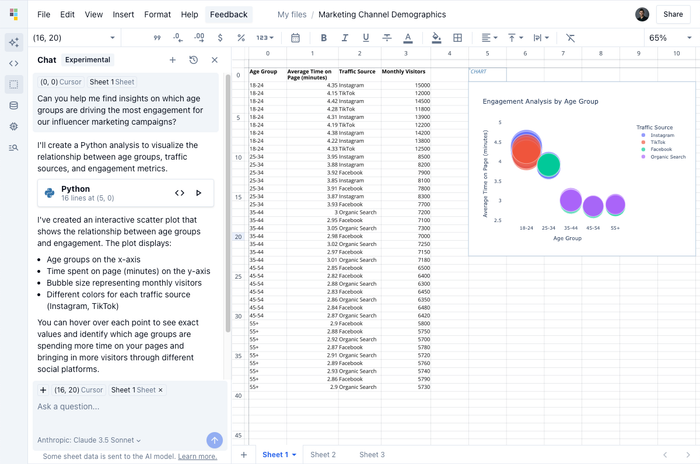
Imagine a marketing team discovering a surge in website traffic. Instead of presenting charts and numbers alone, they craft a narrative: "Our new influencer campaign is driving a younger audience segment to our site. This group's average time on page is 45% longer than the older demographic, suggesting a positive shift in engagement." With these insights, stakeholders see not just the data but the bigger picture—and the action they should take next.

Public policy and journalism
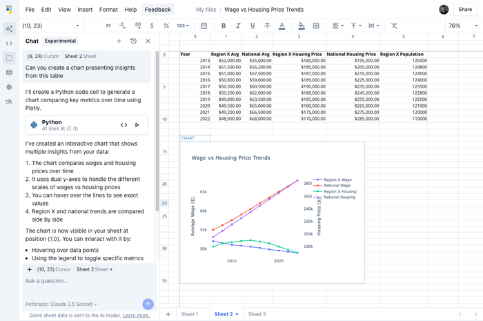
Journalists and policy analysts use data stories to make complex issues accessible. When exploring economic trends, a reporter might say: "Over the last decade, the average wage in region X fell 10% compared to the national average, driving local families to seek more affordable housing options." This framing connects the data to real human experiences.

Nonprofit and advocacy work
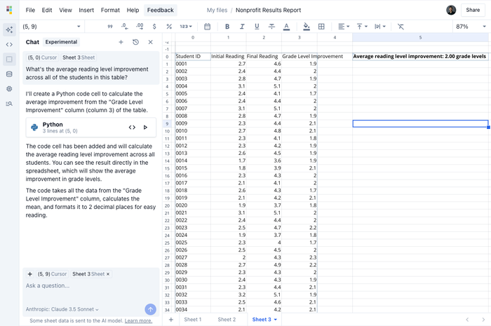
Nonprofits often leverage data to tell a story demonstrating their impact. Instead of stating "Our literacy program reached 2,000 students," they show: "Each participating student gained an average reading level improvement of two grades, transforming their learning journey and future opportunities." Such narratives can inspire donors and stakeholders to support the mission.

Best practices for telling stories with data
Know your audience
Who will read or watch your data analysis narrative? Adjust the complexity, depth, and tone accordingly. Executives might need high-level insights, while analysts may appreciate a more technical approach.
Keep it concise and focused
Resist the temptation to include every data point. Focus on the metrics that support your main story. Brevity ensures your message is clear and memorable.
Iterate and refine
Crafting compelling data stories takes practice. Test early drafts on colleagues or stakeholders, gather feedback and refine. Over time, you'll learn which narratives resonate most powerfully with your audience.
Conclusion
The best data stories do more than inform—they inspire understanding, agreement, and action. Humanizing numbers and providing context makes insights accessible to everyone, regardless of technical skill or familiarity with the underlying data.
Organizations that embrace data storytelling foster a data-driven culture. People become more curious, confident, and proactive about using data to make decisions. With AI data storytelling tools like Quadratic at your disposal, turning numbers into narratives is not only achievable but also a powerful advantage in today's information-rich world.

